6 Data Formats
From Data to Visualization
A chart is essentially a transformation from "data" to "visualization", and this mysterious transformation process seems to have a pattern. We can roughly establish a formula to understand it:
Data + Params = Chart
This formula is just a conceptual thing (not an actual object name used in OrbCharts). How it works in practice is not important. For convenience, we can treat Data and Params as Javascript objects, and Chart as the chart drawn in the browser.
Let's use a minimal example to observe this transformation process from data to visualization.
First, provide a set of json data for Data:
let Data = [
  [ 55, 80, 50, 11, 150 ],
  [ 35, 40, 15, 65, 120 ]
]
And Params initially only specifies the presentation style (layout) as a line chart (Lines):
let Params = {
    layout: 'Lines'
}
We get a line chart:
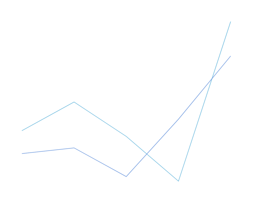
It should be easy to understand the correspondence between data and the chart. In this json data, the first array corresponds to the "light blue" line, and the second array corresponds to the "dark blue" line.
Next, let's make some changes. Change the parameter to:
let Params = {
    layout: 'Bars'
}
This results in a bar chart:
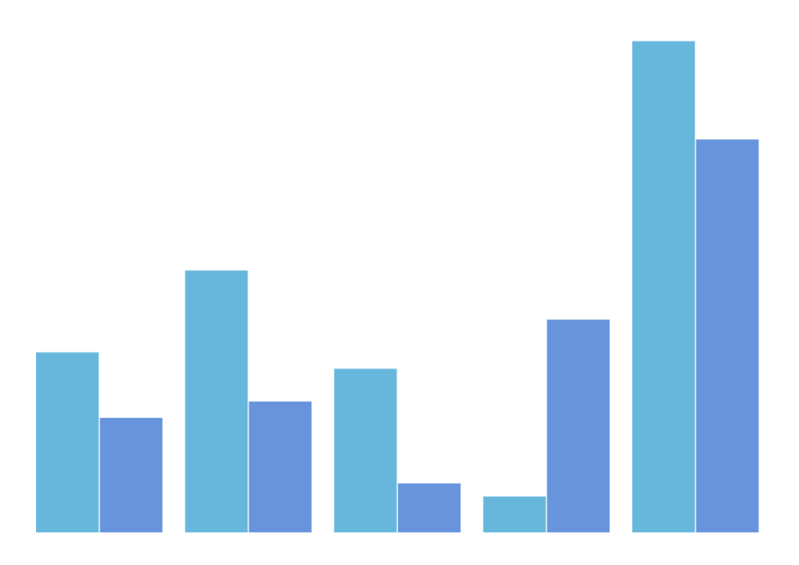
We can see that although the visual elements have changed, the data composition remains the same.
Next, let's add some other Params parameters. For convenience, we first convert Data from json format to matrix format (the data remains the same). In the matrix format, the first row corresponds to the first array in the json, and the second row corresponds to the second array:
     Col1   Col2  Col3   Col4  Col5
Row1 | 55 | 80 | 50 | 11 | 150
Row2 | 35 | 40 | 15 | 65 | 120
In this matrix format, if we group the data by "row" and "column", we get the following results:
- Row:
[55, 80, 50, 11, 150],[35, 40, 15, 65, 120] - Column:
[55, 35],[80, 40],[50, 15],[11, 65],[150, 120]
In our previous line and bar charts, the data was grouped by "row". The first group of data [55, 80, 50, 11, 150] corresponds to the light blue line (or bar), and the second group [35, 40, 15, 65, 120] corresponds to the dark blue line (or bar).
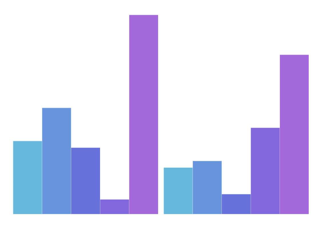
Next, let's add a parameter series, where series = 'column' means grouping by "column".
let Params = {
    layout: 'Bars',
    series: 'column'
}
As mentioned earlier, grouping by "column" results in 5 groups of data, so we get 5 different colored bars:
Similarly, if we change layout back to Lines, we can get 5 different colored lines. We won't continue with more examples.
Understanding this example helps in understanding OrbCharts's design. OrbCharts is designed based on this basic concept. In OrbCharts, Data formats are classified into six types, and each data format corresponds to its own "Params".
WARNING
Note that the "Params" used above is just a conceptual term. In OrbCharts's implementation, there are several different APIs, but this chapter "Basic Concepts" will not mention too many specific implementation details.
In OrbCharts's actual code
For reference, the final bar chart can be converted to OrbCharts's actual code as follows:
import { GridChart, Bars } from 'orbcharts'

const element = document.querySelector('#chart')

const chart = new GridChart(element)

chart.plugins$.next([new Bars()])

chart.dataFormatter$.next({
  seriesDirection: 'column'
})

chart.data$.next([
  [ 55, 80, 50, 11, 150 ],
  [ 35, 40, 15, 65, 120 ]
])
OrbCharts's Data Format Classification
The following sentence can be considered the core design concept of OrbCharts:
"As much as possible, map data to visual elements through parameter changes on the same data."
In other words, OrbCharts abstracts "data structures" - assuming I choose one of the data formats, I can change the chart and its presentation style through parameter changes without changing the data.
Just like the previous examples of bar and line charts, they are the same data format in OrbCharts, and we hope to make as many changes as possible within the same format. Ultimately, we summarized six data formats:
1. Series - Sequential Data
Data is grouped in a one-dimensional way (each data point can also be a group). For example, a pie chart is a common chart type.
2. Grid - Matrix Data
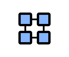
Data is grouped in two dimensions, "row" and "column". Each data point has two-dimensional attributes, so charts often use X and Y axes for drawing. Common chart types include bar charts and line charts.
3. MultiGrid - Multi-Matrix Data
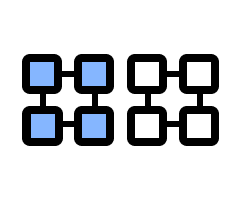
Based on Grid matrix data, it consists of multiple Grid data structures combined. Simply put, it can be understood as merging multiple charts into one.
A common form is multiple data sets with the same dimensional attributes (e.g., multiple data sets with the same time interval) displayed in one chart. A common chart type is a combined bar and line chart, which often has one X-axis and two Y-axes.
4. MultiValue - Multi-Dimensional Data

Each data point has multiple dimensional attributes, but unlike Grid and MultiGrid, it usually does not group data by each dimension. Instead, it emphasizes the visual presentation of each dimensional attribute.
For example, a bubble scatter plot has three-dimensional data mapped to visual attributes: X-coordinate, Y-coordinate, and bubble size (which can be considered as the Z-axis).
5. Relationship - Relational Data
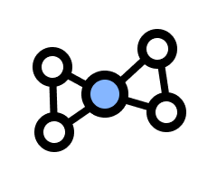
This data format mainly consists of two types of data:
Node: Each individual data point is called a Node. It can be simply identified by an id or have quantitative data (with a
valueattribute).Edge: Data that connects two Nodes is called an Edge. Edges can be "directed" or "undirected". Directed Edges distinguish between "start Node" and "end Node".
This data format focuses on the relationships between data points rather than quantitative statistics. A common chart type is a force-directed graph is a common chart type.
6. Tree - Tree Data
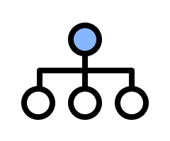
Tree is similar to Relationship in that they both present data relationships. The main difference is that Tree must be structured in a specific way: it has a "root node" and each data point has a one-to-many hierarchical relationship (it does not connect back to itself).
Tree charts and tree maps are common chart types.
TIP
For most users, it is easier to start by learning how to use the desired chart and then understanding the data structure used by that chart.